Milton Avery: American Colourist, Royal Academy review - from backward-looking impressionist to forward looking-colourist | reviews, news & interviews
Milton Avery: American Colourist, Royal Academy review - from backward-looking impressionist to forward looking-colourist
Milton Avery: American Colourist, Royal Academy review - from backward-looking impressionist to forward looking-colourist
A slow reveal of the painter dubbed the American Matisse
Thursday, 14 July 2022
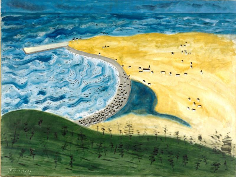
Little Fox River, 1942 by Milton Avery © 2022 Milton Avery Trust / Artists Rights Society (ARS), New York and DACS, London 2022. Photo: Jim Frank
I’ve always been bemused by the American painter, Milton Avery. Not having seen enough of his paintings together, I couldn’t gauge if they are quirkily naive – lodged in a cul de sac aside from the mainstream – or hyper-sophisticated harbingers of things to come.
The Royal Academy’s retrospective, the first of its kind in Europe, reveals that, in a way, he was both. He went from being an impressionist whose landscapes look positively 19th century to making glorious abstractions that anticipate the colour field paintings of Mark Rothko and Barnett Newman. But it was a long haul.
Avery was already 60 when, in the mid 1940s, he began transcribing people and places into areas of flat colour on canvas; and there’s a whole room of earlier explorations to plough through before arriving at his more radical forays into semi-abstraction.
, New York and DACS, London 2022") The first painting you see is Little Fox River, (main picture) a seascape from 1942 in which his tentative moves towards abstraction look more whimsical than progressive. The vantage point is a grassy knoll covered in black scribbles suggestive of trees. In the bay below, the waves are indicated by black squiggles over ripples of blue, while clustered on the arc of grey sand are spindly black and white shapes that could be buildings or cattle. With its flattened space, the picture looks more like the charming efforts of a naive artist than a serious foray into the language of abstraction.
The first painting you see is Little Fox River, (main picture) a seascape from 1942 in which his tentative moves towards abstraction look more whimsical than progressive. The vantage point is a grassy knoll covered in black scribbles suggestive of trees. In the bay below, the waves are indicated by black squiggles over ripples of blue, while clustered on the arc of grey sand are spindly black and white shapes that could be buildings or cattle. With its flattened space, the picture looks more like the charming efforts of a naive artist than a serious foray into the language of abstraction.
Avery later became known as the American Matisse, but at this stage you’d never guess he was even aware of Les Fauves. His breakthrough came in portraits such as Husband and Wife, 1945 (pictured above) in which the artist translates the figures and their surroundings into areas of colour that are emphatically flat yet suggestive both of space and atmosphere. The couple sit on a green chair and yellow ochre sofa, respectively, offset by lilac, pink and lavender walls; she is dressed in shades of blue, he in brown. What makes the picture so delightful are daft anomalies like his red face, yellow hair and transparent pipe and the grey plant wilting on the table between them. Although it was an important development for him, when compared, for instance, with Vanessa Bell’s Studland Beach 1912, the picture is by no means a radical departure. Her abstracted figures predate his by more than 30 years.
In 1949, the artist suffered a major heart attack and, during a slow recovery, he began experimenting with monotypes – spreading ink onto sheets of glass from which to make one-off prints. The experience was a revelation. 200 monotypes later, he was ready to translate the fluency and translucence of ink on paper into oil on canvas with much diluted paint. It’s a great shame that none of the prints is included in the show.
, New York and DACS, London 2022") Over the next 15 years he translated his sketches of sand, ocean and sky into bands of pure colour that were to influence his friends Mark Rothko and Barnett Newman, with whom he shared many summers by the sea, and equally were a response to their more abstract work.
Over the next 15 years he translated his sketches of sand, ocean and sky into bands of pure colour that were to influence his friends Mark Rothko and Barnett Newman, with whom he shared many summers by the sea, and equally were a response to their more abstract work.
In Beach Blankets, 1960 (pictured above) two rugs – one rust, one yellow – lie on pink sand awaiting the return of bathers who have ventured into the sea, which is visible as a dark strip beneath an ochre sky. The heat is almost palpable. Completely abstract yet full of drama, the picture conjures up a story with minimal means.
And that’s where Avery's work differs from that of his younger friends. While his paintings always refer to things seen, the next generation used colour to evoke thoughts and feelings rather than to describe the visible world. The influence went both ways, though, and this makes me see Milton Avery less as a pioneer than an independent spirit who dipped his toe in the mainstream yet remained determinedly to one side of it.
With its flattened space, the picture looks more like the charming efforts of a naive artist than a serious foray into the language of abstraction
rating
Explore topics
Share this article
The future of Arts Journalism
You can stop theartsdesk.com closing!
We urgently need financing to survive. Our fundraising drive has thus far raised £49,000 but we need to reach £100,000 or we will be forced to close. Please contribute here: https://gofund.me/c3f6033d
And if you can forward this information to anyone who might assist, we’d be grateful.

Subscribe to theartsdesk.com
Thank you for continuing to read our work on theartsdesk.com. For unlimited access to every article in its entirety, including our archive of more than 15,000 pieces, we're asking for £5 per month or £40 per year. We feel it's a very good deal, and hope you do too.
To take a subscription now simply click here.
And if you're looking for that extra gift for a friend or family member, why not treat them to a theartsdesk.com gift subscription?
more Visual arts
 'We are bowled over!' Thank you for your messages of love and support
Much-appreciated words of commendation from readers and the cultural community
'We are bowled over!' Thank you for your messages of love and support
Much-appreciated words of commendation from readers and the cultural community
 Photo Oxford 2025 review - photography all over the town
At last, a UK festival that takes photography seriously
Photo Oxford 2025 review - photography all over the town
At last, a UK festival that takes photography seriously
 Gilbert & George, 21st Century Pictures, Hayward Gallery review - brash, bright and not so beautiful
The couple's coloured photomontages shout louder than ever, causing sensory overload
Gilbert & George, 21st Century Pictures, Hayward Gallery review - brash, bright and not so beautiful
The couple's coloured photomontages shout louder than ever, causing sensory overload
 Lee Miller, Tate Britain review - an extraordinary career that remains an enigma
Fashion photographer, artist or war reporter; will the real Lee Miller please step forward?
Lee Miller, Tate Britain review - an extraordinary career that remains an enigma
Fashion photographer, artist or war reporter; will the real Lee Miller please step forward?
 Kerry James Marshall: The Histories, Royal Academy review - a triumphant celebration of blackness
Room after room of glorious paintings
Kerry James Marshall: The Histories, Royal Academy review - a triumphant celebration of blackness
Room after room of glorious paintings
") Folkestone Triennial 2025 - landscape, seascape, art lovers' escape
Locally rooted festival brings home many but not all global concerns
Folkestone Triennial 2025 - landscape, seascape, art lovers' escape
Locally rooted festival brings home many but not all global concerns
 Sir Brian Clarke (1953-2025) - a personal tribute
Remembering an artist with a gift for the transcendent
Sir Brian Clarke (1953-2025) - a personal tribute
Remembering an artist with a gift for the transcendent
 Emily Kam Kngwarray, Tate Modern review - glimpses of another world
Pictures that are an affirmation of belonging
Emily Kam Kngwarray, Tate Modern review - glimpses of another world
Pictures that are an affirmation of belonging
, 2019 by Anselm Kiefer, . Emulsion, oil, acrylic, shellac, straw, gold leaf, wood, wire and sediment of electrolysis on canvas, 470 × 840 cm.") Kiefer / Van Gogh, Royal Academy review - a pairing of opposites
Small scale intensity meets large scale melodrama
Kiefer / Van Gogh, Royal Academy review - a pairing of opposites
Small scale intensity meets large scale melodrama
 Jenny Saville: The Anatomy of Painting, National Portrait Gallery review - a protégé losing her way
A brilliant painter in search of a worthwhile subject
Jenny Saville: The Anatomy of Painting, National Portrait Gallery review - a protégé losing her way
A brilliant painter in search of a worthwhile subject
 Abstract Erotic, Courtauld Gallery review - sculpture that is sensuous, funny and subversive
Testing the boundaries of good taste, and winning
Abstract Erotic, Courtauld Gallery review - sculpture that is sensuous, funny and subversive
Testing the boundaries of good taste, and winning
 Edward Burra, Tate Britain review - watercolour made mainstream
Social satire with a nasty bite
Edward Burra, Tate Britain review - watercolour made mainstream
Social satire with a nasty bite
Add comment