The National Gallery has a range of personas it adopts for its exhibitions, and for this one, about colour, it has deployed the po-faced, teachy one. The pompous tone is because it’s not just about art this time, there’s science in it, which makes it extra serious. And we know it’s science, because the posters and promotional material look like the cover of a chemistry textbook, with bursts of colour against a black background reminiscent of an explosion in a laboratory, or something exciting in space. In fact, the gallery has adopted the science book look wholesale, with black walls throughout and the pictures arranged by colour, to uniquely nauseating effect.
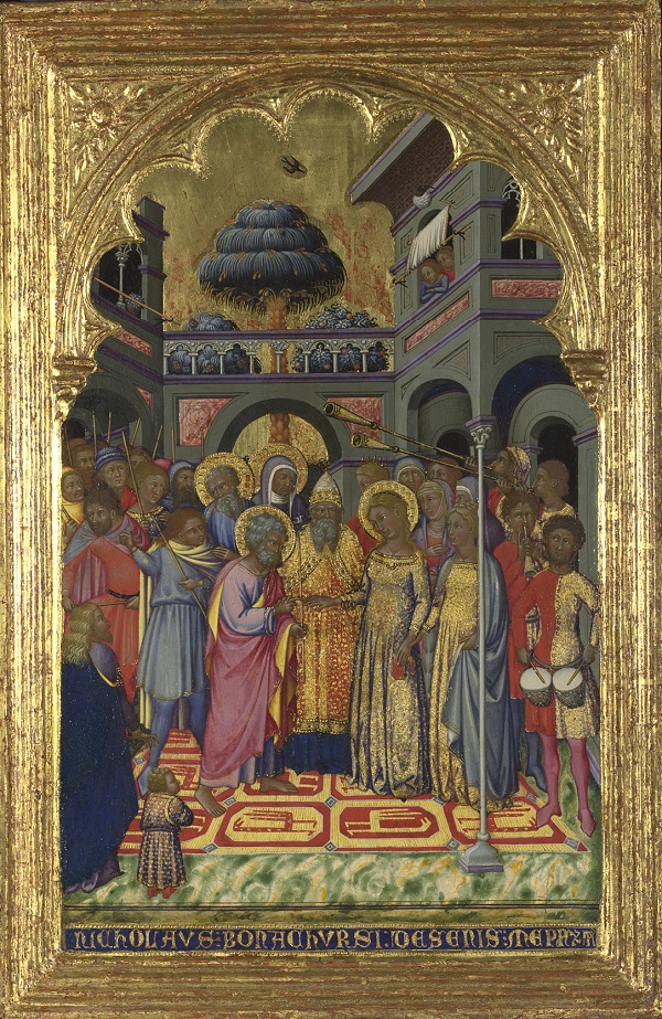
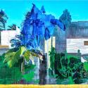
This is a subject I find very, very interesting, and I think it is fair to say that many of the curiosities that arise from looking at early Renaissance paintings, in particular, are to do with colour. The cheerfully exotic blue trees in Niccolò di Buonaccorso’s The Marriage of the Virgin (pictured below left), about 1380, are entirely the result of an unwise choice of pigment. Mixed from a durable blue pigment and a much less light-stable yellow pigment, what must once have been a good strong green has lost all traces of yellow, leaving only a slightly comical, vivid blue.
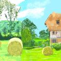
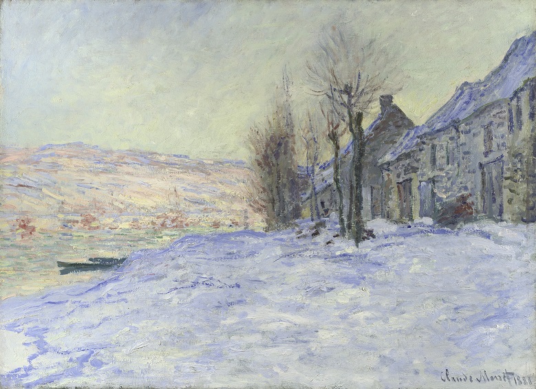 Light sensitive pigments, red ones this time, are the cause of the unhealthy green flesh tones so characteristic of many Renaissance panel paintings. In David Ghirlandaio’s The Virgin and Child with Saint John, probably about 1490-1500, the pink flesh tones have faded so that we can see through to the layer of green earth beneath; put there to balance skin tones and make them more naturalistic, the green was never meant to be visible. And in more modern times, the wonderful icy blue that runs through Monet’s Lavacourt Under Snow (pictured above right), about 1878-81, can be seen as a celebration of cobalt blue, just one of the synthetic blues that revolutionised painting in the 19th century by making available a range of affordable, reliable colours.
I suspect that the exhibition has been organised colour by colour, rather than by date, or geography, because to do so looks technical and dispassionate, in keeping with the exhibition’s decidedly scientific bent. But the approach is riddled with problems, the greatest being that all colours are not equal. Some, like blue and green, really can yield insights into why and how paintings look as they do, but once you get onto yellow and purple, there is only a limited amount to be said.
And so it is that Gainsborough’s The Painter’s Daughters Chasing a Butterfly, about 1756, is put in a room with some other very yellow paintings in order to point out that one of the dresses is painted with lead tin yellow. Queasy headache aside, it is a curatorial strategy that leaves you unable to make any sense of what is on the walls unless you read all the labels, a sure sign that things have gone belly-up.
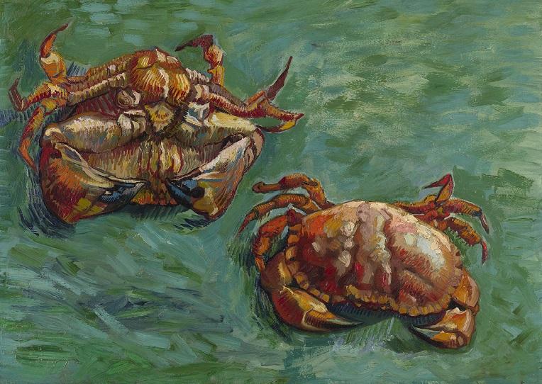
 If you were hoping to be blinded with science, only disappointment awaits. Aside from some photographs showing cross sections of paint layers and occasional little pots of pigment, the science is often elusive and always unsatisfactory. Where it exists, it is descriptive rather than explanatory, and betrays the uneasy relationship between science and art and an uncertainty about how to communicate scientific ideas to the public. A section on colour theory presents an array of paintings that exploit the effects of juxtaposing certain colours, with Van Gogh’s Two Crabs, 1889, (main picture) and Carlo Crivelli’s Saints Peter and Paul, probably 1470s, a fine sight in a room devoted to the stunning results achieved by using combinations of complementary and primary colours.
But should the National Gallery, custodian of one of the world’s great art collections, be quite so surprised that artists knew about these special colour relationships long before scientists formalised them? The curators seem unaccountably amazed that Crivelli’s "sense of colour is intuitive", while Annibale Carracci, who made deliberate use of primary colours despite almost certainly not having read up on colour theory, is treated with the same slack-jawed awe.
It is a worrying disclosure, because it suggests that at the National Gallery, in common with wider society, there is a tendency to elevate science over art, indiscriminately treating science, whether good or bad, with credulous acceptance. Just as cosmetics manufacturers know that a lab coat can shift face cream, this exhibition, which claims to "bring together the worlds of art and science" tries to add value by claiming a scientific basis, while simultaneously backing away from taxing its audience with any genuine insights. The tendency to crave validation by science is an insidious one, that undermines the value that good science can offer while pointing to a fundamental lack of confidence in art itself from the very institution that should be its champion.






Add comment