There are two films in the Turner Prize exhibition and taken together and watched end-to-end they last just under three hours. That sounds gruelling for an art exhibition, but they’re from the strongest two candidates on this year’s shortlist. And since neither is one of those poorly filmed and edited pieces that are best viewed as moving wallpaper as you drift in and out of the gallery, both are worth devoting time to.
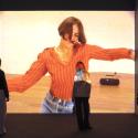
The first is by Elizabeth Price, which is 20-minutes long. The Woolworths Choir of 1979 (image below left) is a beautifully constructed and rather captivating, as well as disturbing film. It’s made up of three distinct but seamlessly overlapping segments. Still images, repeated motifs, archive footage, text and voiceover are all used.
 The first part is a bit like a nicely crafted PowerPoint presentation: black and white photographs featuring close-up images of gothic church architecture pop up, and a description of their functions is given through short text and voiceover. We’re briefly invited to ponder the etymologies of the words “choir” and “quire”, and each slide change is accompanied by the sound of an amplified finger-click, which could also be the sound of an old-fashioned projector changing slides. This then overlaps with pop images of girl bands – a line-up of 60s and 70s pop "choirs" overlaid with a Shangri Las soundtrack - which eventually segues into newsreel of a real event: a fire in the furniture department of a Manchester Woolworths in 1979 which killed 10 people.
Aural and visual motifs connect the passages, forming rhythmic echoes. Hand gestures, for instance, are sequentially repeated, ending in an arm waving through window bars amid billowing smoke from the burning building. The film is edited very precisely, with choreographed restraint, and the effect is cumulative, seductive and powerful. It’s also chilling, and Price shows immense skill in knitting together the overlapping sequences.
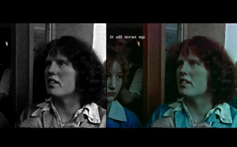
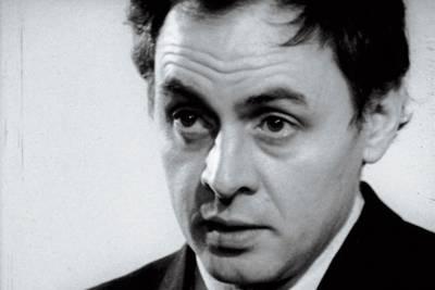
Price’s film is relatively short compared to Luke Fowler’s feature-length All Selves Divides (main image), which is just over 90-minutes long. However, you’ll probably be too absorbed to notice the time. Fowler’s film, about the Scottish psychiatrist/counter-culture guru turned troubled alcoholic RD Laing, is superb. In fact, it’s an utterly fascinating and deeply empathetic portrayal of a troubled and troubling figure. The archive footage is intercut with sequences filmed by Fowler himself which are more abstract. The borrowed footage is made up of documentaries and interviews featuring Laing and his work, together with footage of documentaries featuring psychiatric encounters in traditional medical set-ups of the day. They make a compelling counterpoint.
 Fowler has made three Laing films to date. The first one was shortlisted for Beck’s Futures in 2005 and was shown at the ICA. Unlike All Selves Divided, it was badly presented by the gallery, and although certainly interesting in itself – it was about Laing’s experimental community at Kingsley Hall – the original footage seemed to have received little intervention from Fowler. All Selves Divided is far superior and is the most sophisticated of the trilogy. It would be good to see him win.
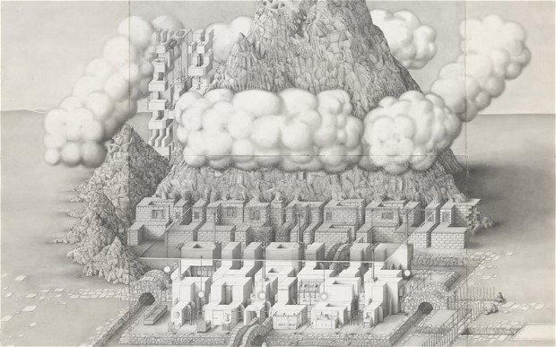
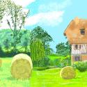
We then have the obsessively detailed, large-scale drawings of Paul Noble (image above right). By now most will have heard of Noble’s two-decade long project featuring the fictive Nobson Newtown. His technical draughtsmanship is superb, but ultimately, and especially in the animated spaces of the Turner Prize exhibition, the drawings appear quite lifeless. The precision may impress, but there's something just incredibly inert about the result.
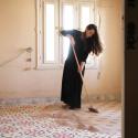
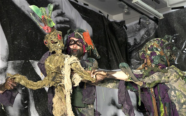 Spartacus Chetwynd is the artist who seems to have gleaned the most column inches in the broadsheet press. One can guess why – the artist apparently lives in a nudist colony in South London and presents performances which hint at Dionysian excess. However, the reality is neither very Dionysian (in one performance - image left - a dying tree oracle tells you your fate) nor very Rabelaisian (there are references to Rabelais in some scrappy cut-outs lining a wall), but is merely shambolic. What might hint at dangerous chaos, or even just exuberant fun, turns out to be one formless, flatulent mess. As art, it really couldn’t be less interesting. In any case, she appears to have confused fun with a total lack of craft – citing the Marx Brothers as an influence is the funniest thing about it.
- Turner Prize 2012 at Tate Britain until 6 January, 2013





Add comment