Mondrian, Turner Contemporary/ Tate Liverpool | reviews, news & interviews
Mondrian, Turner Contemporary/ Tate Liverpool
Mondrian, Turner Contemporary/ Tate Liverpool
Two exhibitions offer an overview of the modernist artist, yet he still eludes us
Sunday, 13 July 2014
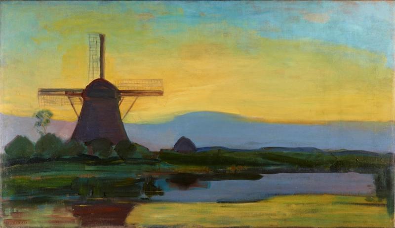
Piet Mondrian, Oostzijdse Mill with Extended Blue, Yellow and Purple Sky, 1907-8© 2014 Mondrian/Holtzman Trust; Gemeentemuseum, The Hague
It’s 70 years since Mondrian died in New York, leaving unfinished his last painting, Victory Boogie-Woogie, an ebullient title quite at odds with the buttoned-up asceticism we normally associate with this artist. The Courtauld Gallery showed a small survey two years ago, which paired his flat grid compositions with the paintings and white reliefs of Ben Nicholson, focusing only on his two years in London (1938 to 1940).
Though it proved surprisingly illuminating, in its precise, compare-and-contrast way, any exhibition promising a little more depth must be welcome.
Now we have two, concurrent and complementary (if geographically distant) surveys. Yet even if you put them both together they’d fail to provide anything like a complete picture of this most rigorous and austere of modernist artists.
The smaller exhibition, at Turner Contemporary in Margate, features some wonderfully luminous painting. It looks at Mondrian’s early figurative canvases and the beginnings of his grid motif, and yet it never adequately explores that transition. The second, at Tate Liverpool, recreates his studios in Amsterdam, Paris and New York, and gives us, fully formed, the Mondrian that’s instantly recognisable to all: the black intersecting horizontal and vertical lines containing blue, yellow and red rectangles, against a white (initially grey) surface, in tautly balanced compositions. (Pictured below: Composition with Yellow, Blue and Red, 1937-42)
 The Tate show features no figurative works, but it does show how the paintings and the studio embodied the same “Neo-plastic” aesthetic principles. Following the De Stijl philosophy, the Dutch modernist movement which forged a synthesis between painting, design and architecture, his studios are, with their neat primary coloured wall panels and work surfaces and clean white walls, like 3D representations of his paintings. They look, at least to our eyes now, more nursery room than atelier. If Francis Bacon’s studio, containing the accumulated detritus of the artist’s long life, presents one extreme of the artist’s habitat, then Mondrian’s must present the other.
But if only we had one or two examples of the paintings he painted in the last four years of his life, to go with that last studio in New York. Their jazz-inflected, syncopated rhythms show what a difference America made, how re-energising this final journey. But one can only borrow what is readily loaned.
Comprising paintings which are mostly on loan from the Gemeentemuseum in the Hague, Turner Contemporary’s display is by far the most intriguing, not least because it features the paintings with which we are least familiar. It shows how the Dutch artist absorbed, in quick succession, one avant-garde style after another: 19th-century Realism, symbolism, Impressionism, pointillism. Each, with varying success, finds its moment. In one canvas, our eyes note the sinuous Art Nouveau lines formed by tree trunks in a dense, moonlit wood. In another, far more prosaic in execution, we find the square-set features of a Dutch peasant farmer made up with thick pointillist marks in pink and yellowish hues.
But all these stylistic flirtations are underpinned by a resolutely Dutch, or at least Northern European, sensibility. The earliest paintings here are in the manner of The Hague School, a dour Dutch variant of the French Barbizon School. Colours are dark and earthy – browns predominate – while forms are squat and solid.
 As he becomes exposed to the French avant-garde, Mondrian’s palette lightens. But acid-tinged hues are favoured, with slightly discordant, cool notes over warm, harmonious ones. The exhibition is titled Mondrian and Colour, yet I feel it makes too much of the influence of Goethe’s colour theories. In 1909 he joined the Dutch branch of the Theosophical Society, that most modernist of creeds, and colours and forms become imbued with spiritual significance. (Pictured left: The Red Mill, 1911)
Turner Contemporary’s exhibition is by far the more seductive of the two, but we make a blind leap into abstraction far too suddenly. Crucial parts of the jigsaw are missing in this complex picture. There are no paintings from his single tree series which would illustrate the transition from figuration to the abstraction of interlocking lines beautifully. But limitations aside, one must acknowledge the compelling nature of this display. I’d urge you to pay a visit.
If Francis Bacon’s studio presents one extreme of the artist’s habitat, then Mondrian’s must present the other
Explore topics
Share this article
The future of Arts Journalism
You can stop theartsdesk.com closing!
We urgently need financing to survive. Our fundraising drive has thus far raised £49,000 but we need to reach £100,000 or we will be forced to close. Please contribute here: https://gofund.me/c3f6033d
And if you can forward this information to anyone who might assist, we’d be grateful.

Subscribe to theartsdesk.com
Thank you for continuing to read our work on theartsdesk.com. For unlimited access to every article in its entirety, including our archive of more than 15,000 pieces, we're asking for £5 per month or £40 per year. We feel it's a very good deal, and hope you do too.
To take a subscription now simply click here.
And if you're looking for that extra gift for a friend or family member, why not treat them to a theartsdesk.com gift subscription?
more Visual arts
 'We are bowled over!' Thank you for your messages of love and support
Much-appreciated words of commendation from readers and the cultural community
'We are bowled over!' Thank you for your messages of love and support
Much-appreciated words of commendation from readers and the cultural community
") Folkestone Triennial 2025 - landscape, seascape, art lovers' escape
Locally rooted festival brings home many but not all global concerns
Folkestone Triennial 2025 - landscape, seascape, art lovers' escape
Locally rooted festival brings home many but not all global concerns
 Sir Brian Clarke (1953-2025) - a personal tribute
Remembering an artist with a gift for the transcendent
Sir Brian Clarke (1953-2025) - a personal tribute
Remembering an artist with a gift for the transcendent
 Emily Kam Kngwarray, Tate Modern review - glimpses of another world
Pictures that are an affirmation of belonging
Emily Kam Kngwarray, Tate Modern review - glimpses of another world
Pictures that are an affirmation of belonging
, 2019 by Anselm Kiefer, . Emulsion, oil, acrylic, shellac, straw, gold leaf, wood, wire and sediment of electrolysis on canvas, 470 × 840 cm.") Kiefer / Van Gogh, Royal Academy review - a pairing of opposites
Small scale intensity meets large scale melodrama
Kiefer / Van Gogh, Royal Academy review - a pairing of opposites
Small scale intensity meets large scale melodrama
 Jenny Saville: The Anatomy of Painting, National Portrait Gallery review - a protégé losing her way
A brilliant painter in search of a worthwhile subject
Jenny Saville: The Anatomy of Painting, National Portrait Gallery review - a protégé losing her way
A brilliant painter in search of a worthwhile subject
 Abstract Erotic, Courtauld Gallery review - sculpture that is sensuous, funny and subversive
Testing the boundaries of good taste, and winning
Abstract Erotic, Courtauld Gallery review - sculpture that is sensuous, funny and subversive
Testing the boundaries of good taste, and winning
 Edward Burra, Tate Britain review - watercolour made mainstream
Social satire with a nasty bite
Edward Burra, Tate Britain review - watercolour made mainstream
Social satire with a nasty bite
 Ithell Colquhoun, Tate Britain review - revelations of a weird and wonderful world
Emanations from the unconscious
Ithell Colquhoun, Tate Britain review - revelations of a weird and wonderful world
Emanations from the unconscious
 Rachel Jones: Gated Canyons, Dulwich Picture Gallery review - teeth with a real bite
Mouths have never looked so good
Rachel Jones: Gated Canyons, Dulwich Picture Gallery review - teeth with a real bite
Mouths have never looked so good
 Yoshitomo Nara, Hayward Gallery review - sickeningly cute kids
How to make millions out of kitsch
Yoshitomo Nara, Hayward Gallery review - sickeningly cute kids
How to make millions out of kitsch
 Hamad Butt: Apprehensions, Whitechapel Gallery review - cool, calm and potentially lethal
The YBA who didn’t have time to become a household name
Hamad Butt: Apprehensions, Whitechapel Gallery review - cool, calm and potentially lethal
The YBA who didn’t have time to become a household name
Add comment