Catherine, Duchess of Cambridge, National Portrait Gallery | reviews, news & interviews
Catherine, Duchess of Cambridge, National Portrait Gallery
Catherine, Duchess of Cambridge, National Portrait Gallery
Not a great painting, nor a risible one: in the circumstances, artist Paul Elmsley doesn't do a bad job
Saturday, 12 January 2013
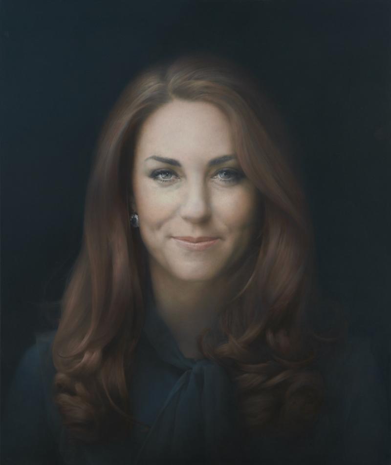
The Duchess of Cambridge by Paul Emsley, 2012© National Portrait Gallery, London
The first thing to say about Paul Elmsley’s portrait of the Duchess of Cambridge, which was unveiled yesterday at the National Portrait Gallery, is that it looks rather better in real life than it does in reproduction. That doesn’t make it a great painting, but nor is it a risible one.
The soft-focused, Vaseline-smeared visage, framed by that undulating cascade of buoyant hair (it’s unfortunate how much this makes her look as if she's taking part in an ad campaign for shampoo) is more convincingly defined and skilfully modelled than it is when you see it on the screen.
Certainly, there’s a liveliness around the eyes and mouth that isn’t conveyed in a reproduction, with the reproduction’s flattening effect. And in fact, it’s those eyes that draw you to the portrait, animating Kate’s features and echoing the sapphire and diamond earring that is the only piece of jewellery visible (her late mother-in-law’s, worn during the announcement of Diana and Charles’s engagement) in what is otherwise a very plain, unfussy portrait. And it’s a good physical likeness. More than that, with her slightly guarded smile coupled with her arrestingly direct gaze, it captures both a sense of the sitter’s warmth and openness as well as a certain girlish diffidence.
Kate looks stiff and rather straitjacketed in that big-bowed blouse that comes up to her throat
But let’s not get carried away. This is a terribly conventional portrait. And it’s a disappointing portrait. If it had been a head portrait rather than a looking-straight-ahead, quarter-length one, the painting might have been more enlivened by those quietly animated features. Instead, Kate looks stiff and rather straitjacketed in that big-bowed blouse that comes up to her throat.
But here’s the real problem. We do not live in the age of royal portraiture. Its role, like that of the Royal Family, is not as clear-cut as it once was and is substantially diminished as a result. Just as the nation has not yet fully adjusted to a relationship that balances deference and familiarity on one side, and intimacy and aloofness on the other, neither has the royal portrait.
Moreover, how does the artist portray a member of a traditional institution in a visual idiom that has its roots in the early Renaissance? Royal portraiture is today as much of an anachronism as the role of the Poet Laureate. Do poets use the language of Dryden to pronounce upon the splendiferous majesty of Her Majesty? How does the poet write verse in celebration of a royal event that doesn't appear absurd? Ask Andrew Motion. On second thoughts, better not. It’s an impossible task and Elmsley hasn’t done a bad job under the circumstances. He’s certainly done a better one than Lucian Freud did with the Queen.
But, like Kate as she appears in her first official portrait, any artist commissioned to paint a royal likeness will be straitjacketed, by convention, by tradition and by duty. What a thankless task for the artist.
- Paul Elmsley’s portrait of the Catherine, Duchess of Cambridge on permanent view at the National Portrait Gallery
How do you portray a member of a traditional institution in a visual idiom that has its roots in the early Renaissance?
Explore topics
Share this article
Add comment
The future of Arts Journalism
You can stop theartsdesk.com closing!
We urgently need financing to survive. Our fundraising drive has thus far raised £49,000 but we need to reach £100,000 or we will be forced to close. Please contribute here: https://gofund.me/c3f6033d
And if you can forward this information to anyone who might assist, we’d be grateful.

Subscribe to theartsdesk.com
Thank you for continuing to read our work on theartsdesk.com. For unlimited access to every article in its entirety, including our archive of more than 15,000 pieces, we're asking for £5 per month or £40 per year. We feel it's a very good deal, and hope you do too.
To take a subscription now simply click here.
And if you're looking for that extra gift for a friend or family member, why not treat them to a theartsdesk.com gift subscription?
more Visual arts
 'We are bowled over!' Thank you for your messages of love and support
Much-appreciated words of commendation from readers and the cultural community
'We are bowled over!' Thank you for your messages of love and support
Much-appreciated words of commendation from readers and the cultural community
") Folkestone Triennial 2025 - landscape, seascape, art lovers' escape
Locally rooted festival brings home many but not all global concerns
Folkestone Triennial 2025 - landscape, seascape, art lovers' escape
Locally rooted festival brings home many but not all global concerns
 Sir Brian Clarke (1953-2025) - a personal tribute
Remembering an artist with a gift for the transcendent
Sir Brian Clarke (1953-2025) - a personal tribute
Remembering an artist with a gift for the transcendent
 Emily Kam Kngwarray, Tate Modern review - glimpses of another world
Pictures that are an affirmation of belonging
Emily Kam Kngwarray, Tate Modern review - glimpses of another world
Pictures that are an affirmation of belonging
, 2019 by Anselm Kiefer, . Emulsion, oil, acrylic, shellac, straw, gold leaf, wood, wire and sediment of electrolysis on canvas, 470 × 840 cm.") Kiefer / Van Gogh, Royal Academy review - a pairing of opposites
Small scale intensity meets large scale melodrama
Kiefer / Van Gogh, Royal Academy review - a pairing of opposites
Small scale intensity meets large scale melodrama
 Jenny Saville: The Anatomy of Painting, National Portrait Gallery review - a protégé losing her way
A brilliant painter in search of a worthwhile subject
Jenny Saville: The Anatomy of Painting, National Portrait Gallery review - a protégé losing her way
A brilliant painter in search of a worthwhile subject
 Abstract Erotic, Courtauld Gallery review - sculpture that is sensuous, funny and subversive
Testing the boundaries of good taste, and winning
Abstract Erotic, Courtauld Gallery review - sculpture that is sensuous, funny and subversive
Testing the boundaries of good taste, and winning
 Edward Burra, Tate Britain review - watercolour made mainstream
Social satire with a nasty bite
Edward Burra, Tate Britain review - watercolour made mainstream
Social satire with a nasty bite
 Ithell Colquhoun, Tate Britain review - revelations of a weird and wonderful world
Emanations from the unconscious
Ithell Colquhoun, Tate Britain review - revelations of a weird and wonderful world
Emanations from the unconscious
 Rachel Jones: Gated Canyons, Dulwich Picture Gallery review - teeth with a real bite
Mouths have never looked so good
Rachel Jones: Gated Canyons, Dulwich Picture Gallery review - teeth with a real bite
Mouths have never looked so good
 Yoshitomo Nara, Hayward Gallery review - sickeningly cute kids
How to make millions out of kitsch
Yoshitomo Nara, Hayward Gallery review - sickeningly cute kids
How to make millions out of kitsch
 Hamad Butt: Apprehensions, Whitechapel Gallery review - cool, calm and potentially lethal
The YBA who didn’t have time to become a household name
Hamad Butt: Apprehensions, Whitechapel Gallery review - cool, calm and potentially lethal
The YBA who didn’t have time to become a household name
Comments
No, it's risible. End of.
Funny how all the "Art