Martin Creed: What’s the point of it? Hayward Gallery | reviews, news & interviews
Martin Creed: What’s the point of it? Hayward Gallery
Martin Creed: What’s the point of it? Hayward Gallery
Silly, serious and a sensory delight. Work from the artist who won the Turner Prize turning the lights off and on
Wednesday, 29 January 2014
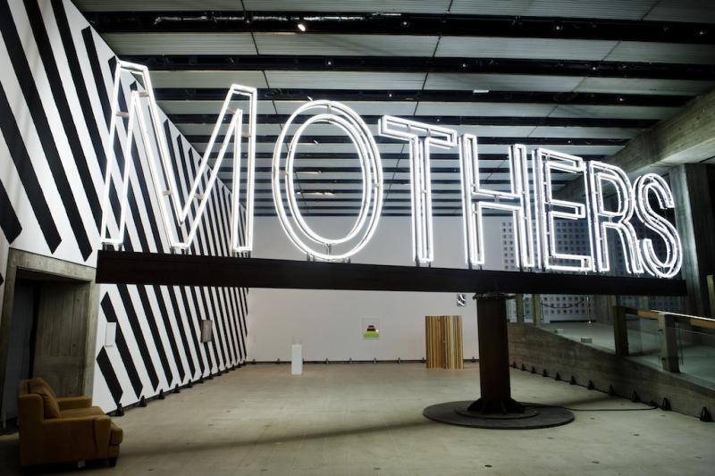
Installation shot with Work No. 1092 'Mothers' (2011) by Martin CreedInstallation shots by Linda Nylind
If you're suffering from the January blues, hurry to the Southbank Centre where Martin Creed’s exhibition is bound to make you smile. The man best known for winning the Turner Prize in 2001 by switching the lights on and off at Tate Britain has filled both floors of the Hayward Gallery with things that not only lift the spirits but reveal how to make magic from virtually nothing.
Nor is this an example of art lite; we tend to think of humour as an easy option, but sustaining a joke over five galleries and three terraces is a serious challenge. One false move and the whole thing falls apart; but Creed’s sense of time and space are impeccable. The installation is perfectly poised to keep you engaged, surprised, amused and possibly outraged at every turn.
 The assault on the senses starts as soon as you put your nose through the door. Partially blocking the entrance is an old sofa that you have to negotiate before gaining access. It might be wise to slump into its soft, leathery embrace because standing up proves hazardous. Dominating the space is a huge neon sign that reads MOTHERS (main picture). Supported on a heavyweight iron contraption, the sign revolves at speed. The arms are so long that they narrowly miss the walls, as they swish round and round, and so low that decapitation seems inevitable. I instinctively ducked each time it approached and worried that my companion would have his head knocked off.
Lining the walls are 39 metronomes, each marking time at a different speed. Their insistent clacking is like a chorus of disapproval – the tutting of wagging tongues – or the gallows laughter of a crowd enjoying the discomfort of others. A photograph of Creed grinning like a deranged nerd beckons from the far end of the room, where a rather beautiful lithograph greets you with bands of cheerful colour stacked into a ziggurat. I was just beginning to relax when a reflection of the swirling sign suddenly induced a wave of nausea. With my heart beating fast, I escaped to the next gallery while the cackling of the metronomes continued behind me.
 Annoying sounds permeate this space as well, though. A pianist plods up the scale, hitting every note on the keyboard, and then pauses before trundling down again. At the far end, someone repeatedly blows a raspberry; it's a silly, schoolboy sound. Wet and slightly obscene, it makes it hard to concentrate on a row of exquisite drawings made with felt tip pen. Bands of colour traverse the paper creating waves like patterns, or wall-like blocks reminiscent of the drawings slaved over in the 1970s by earnest practitioners like myself.
Creed gently mocks every -ism that crosses his path. Stacks of I beams give a knowing nod to heavy metal sculpture; pyramids of cardboard boxes salute the millions who solemnly use found materials (pictured below left: Work No. 916, 2008). Upstairs, a wall decorated with adhesive tape in a gaudy array of colours and patterns (pictured above: installation shot with Work No. 1806, 2014) makes Daniel Buren’s lifelong obsession with vertical stripes seem especially ridiculous, while a floor to ceiling pyramid of pink toilet rolls pays homage to the pure geometry of minimalism while gleefully subverting its high-mindedness.
 Creed has an uncanny knack for lowering the tone by reducing complex questions into simple solutions. Like lessons for people new to picture-making, a set of drawings shows one how to create stripes, zigzags, arcs and spirals. Demonstrating the visual building blocks of art, the drawings remind me of the basic design course I once ran in which we explored issues such as positive versus negative space, surface versus depth, and dynamic versus static composition, and so on.
Ziggurats formed from subtle bands of watercolour invite you to examine your responses (pictured top right: Work No. 1315, 2011). One image seems vulnerable, another cheerful and a third sinister; but why? Such questions keep arising. Why do I prefer these brushmarks to those? In what circumstances can a blob of Blu-Tack, a cube of masking tape, a room lined with carpet tiles, a brick wall and a black curtain gliding open and shut be considered art? And how do we know; how do we confer meaning or value on useless things? One of Creed’s neon signs reads THINGS and just as he paints portraits as well as abstract compositions, so he photographs a tall shaggy dog beside a short wiry one (pictured above: Work No. 1094, 2011), as if the answer lay simply in diversity.
 What other resources can an artist exploit? What potential lies in the functions of the human body? On film, we see a penis rise and fall as desire grows or diminishes. It is as matter of fact as a scientific study, or as emotive as the rising and falling notes played in the lift by a harmonica, as the mechanism goes up and down. You decide. Two people stick fingers down their throats to produce pools of vomit and, squatting in a pristine white environment, a girl extrudes a neat pile of poo. Are their contributions art, or has an invisible line been crossed? Has decency been violated?
Provocation is the name of the game, but pleasure is also high on the agenda. Far from being a po-faced exploration of the meaning of art, this exhibition is a sensory delight. A whole wall is filled with prints made from broccoli heads. Printed with sparkling, mat, fluorescent or opaque ink in a huge range of colours, the pictures are utterly daft and completely captivating.
 You are invited to admire the performance of a Ford Focus as it unexpectedly leaps into autonomous action on one of the terraces, or dive into a space filled with white balloons (pictured above) that make you lose all sense of direction; the experience is claustrophobic or playfully disorientating, depending on your temperament or who you share the space with.
Art that is beautiful, sensuous, silly and also deeply serious. What more could you want? I stayed for hours and laughed all the way round.
- Martin Creed: What’s the point of it? at the Hayward Gallery until 27 April
Squatting in a pristine white environment, a girl extrudes a neat pile of poo
Buy
Explore topics
Share this article
Add comment
The future of Arts Journalism
You can stop theartsdesk.com closing!
We urgently need financing to survive. Our fundraising drive has thus far raised £49,000 but we need to reach £100,000 or we will be forced to close. Please contribute here: https://gofund.me/c3f6033d
And if you can forward this information to anyone who might assist, we’d be grateful.

Subscribe to theartsdesk.com
Thank you for continuing to read our work on theartsdesk.com. For unlimited access to every article in its entirety, including our archive of more than 15,000 pieces, we're asking for £5 per month or £40 per year. We feel it's a very good deal, and hope you do too.
To take a subscription now simply click here.
And if you're looking for that extra gift for a friend or family member, why not treat them to a theartsdesk.com gift subscription?
more Visual arts
 'We are bowled over!' Thank you for your messages of love and support
Much-appreciated words of commendation from readers and the cultural community
'We are bowled over!' Thank you for your messages of love and support
Much-appreciated words of commendation from readers and the cultural community
 Lee Miller, Tate Britain review - an extraordinary career that remains an enigma
Fashion photographer, artist or war reporter; will the real Lee Miller please step forward?
Lee Miller, Tate Britain review - an extraordinary career that remains an enigma
Fashion photographer, artist or war reporter; will the real Lee Miller please step forward?
 Kerry James Marshall: The Histories, Royal Academy review - a triumphant celebration of blackness
Room after room of glorious paintings
Kerry James Marshall: The Histories, Royal Academy review - a triumphant celebration of blackness
Room after room of glorious paintings
") Folkestone Triennial 2025 - landscape, seascape, art lovers' escape
Locally rooted festival brings home many but not all global concerns
Folkestone Triennial 2025 - landscape, seascape, art lovers' escape
Locally rooted festival brings home many but not all global concerns
 Sir Brian Clarke (1953-2025) - a personal tribute
Remembering an artist with a gift for the transcendent
Sir Brian Clarke (1953-2025) - a personal tribute
Remembering an artist with a gift for the transcendent
 Emily Kam Kngwarray, Tate Modern review - glimpses of another world
Pictures that are an affirmation of belonging
Emily Kam Kngwarray, Tate Modern review - glimpses of another world
Pictures that are an affirmation of belonging
, 2019 by Anselm Kiefer, . Emulsion, oil, acrylic, shellac, straw, gold leaf, wood, wire and sediment of electrolysis on canvas, 470 × 840 cm.") Kiefer / Van Gogh, Royal Academy review - a pairing of opposites
Small scale intensity meets large scale melodrama
Kiefer / Van Gogh, Royal Academy review - a pairing of opposites
Small scale intensity meets large scale melodrama
 Jenny Saville: The Anatomy of Painting, National Portrait Gallery review - a protégé losing her way
A brilliant painter in search of a worthwhile subject
Jenny Saville: The Anatomy of Painting, National Portrait Gallery review - a protégé losing her way
A brilliant painter in search of a worthwhile subject
 Abstract Erotic, Courtauld Gallery review - sculpture that is sensuous, funny and subversive
Testing the boundaries of good taste, and winning
Abstract Erotic, Courtauld Gallery review - sculpture that is sensuous, funny and subversive
Testing the boundaries of good taste, and winning
 Edward Burra, Tate Britain review - watercolour made mainstream
Social satire with a nasty bite
Edward Burra, Tate Britain review - watercolour made mainstream
Social satire with a nasty bite
 Ithell Colquhoun, Tate Britain review - revelations of a weird and wonderful world
Emanations from the unconscious
Ithell Colquhoun, Tate Britain review - revelations of a weird and wonderful world
Emanations from the unconscious
 Rachel Jones: Gated Canyons, Dulwich Picture Gallery review - teeth with a real bite
Mouths have never looked so good
Rachel Jones: Gated Canyons, Dulwich Picture Gallery review - teeth with a real bite
Mouths have never looked so good
Comments
At that is empty headed is
It's interesting that Sarah