Winter Olympics pics - and why 2012 pictograms score badly | reviews, news & interviews
Winter Olympics pics - and why 2012 pictograms score badly
Winter Olympics pics - and why 2012 pictograms score badly
Wednesday, 03 March 2010
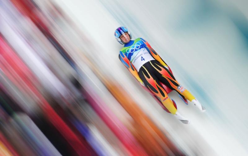
Shaun Botterill/ Getty Images
The Big Picture has a collection of some extraordinary photos of the Winter Olympics here. Below pic credit: Martin Bureau/AFP/Getty Images

Meanwhile, the New York Times has posted a fascinating video piece (below) about Olympic signage and the designs of the pictograms used in differerent sports. From the Berlin Olympics of 1936 via the psychedelic design of the 1968 Mexico Olympics to London 2012. The Munich, Beijing and Athens Olympics all are rated highly for design. London's for 2012 aren't in the medals: "they look as if a child has done them. Primitive, perhaps - but not in a good way."
Meanwhile, the New York Times has posted a fascinating video piece (below) about Olympic signage and the designs of the pictograms used in differerent sports. From the Berlin Olympics of 1936 via the psychedelic design of the 1968 Mexico Olympics to London 2012. The Munich, Beijing and Athens Olympics all are rated highly for design. London's for 2012 aren't in the medals: "they look as if a child has done them. Primitive, perhaps - but not in a good way."
The Big Picture has a collection of some extraordinary photos of the Winter Olympics here. Below pic credit: Martin Bureau/AFP/Getty Images
Meanwhile, the New York Times has posted a fascinating video piece (below) about Olympic signage and the designs of the pictograms used in differerent sports. From the Berlin Olympics of 1936 via the psychedelic design of the 1968 Mexico Olympics to London 2012. The Munich, Beijing and Athens Olympics all are rated highly for design. London's for 2012 aren't in the medals: "they look as if a child has done them. Primitive, perhaps - but not in a good way."
Meanwhile, the New York Times has posted a fascinating video piece (below) about Olympic signage and the designs of the pictograms used in differerent sports. From the Berlin Olympics of 1936 via the psychedelic design of the 1968 Mexico Olympics to London 2012. The Munich, Beijing and Athens Olympics all are rated highly for design. London's for 2012 aren't in the medals: "they look as if a child has done them. Primitive, perhaps - but not in a good way."
The future of Arts Journalism
You can stop theartsdesk.com closing!
We urgently need financing to survive. Our fundraising drive has thus far raised £49,000 but we need to reach £100,000 or we will be forced to close. Please contribute here: https://gofund.me/c3f6033d
And if you can forward this information to anyone who might assist, we’d be grateful.

Subscribe to theartsdesk.com
Thank you for continuing to read our work on theartsdesk.com. For unlimited access to every article in its entirety, including our archive of more than 15,000 pieces, we're asking for £5 per month or £40 per year. We feel it's a very good deal, and hope you do too.
To take a subscription now simply click here.
And if you're looking for that extra gift for a friend or family member, why not treat them to a theartsdesk.com gift subscription?
more
 'We are bowled over!' Thank you for your messages of love and support
Much-appreciated words of commendation from readers and the cultural community
'We are bowled over!' Thank you for your messages of love and support
Much-appreciated words of commendation from readers and the cultural community
 Music Reissues Weekly: The Peanut Butter Conspiracy - The Most Up Till Now
Definitive box-set celebration of the Sixties California hippie-pop band
Music Reissues Weekly: The Peanut Butter Conspiracy - The Most Up Till Now
Definitive box-set celebration of the Sixties California hippie-pop band
 Goldscheider, Brother Tree Sound, Kings Place review - music of hope from a young composer
Unusual combination of horn, strings and electronics makes for some intriguing listening
Goldscheider, Brother Tree Sound, Kings Place review - music of hope from a young composer
Unusual combination of horn, strings and electronics makes for some intriguing listening
 The Billionaire Inside Your Head, Hampstead Theatre review - a map of a man with OCD
Will Lord's promising debut burdens a fine cast with too much dialogue
The Billionaire Inside Your Head, Hampstead Theatre review - a map of a man with OCD
Will Lord's promising debut burdens a fine cast with too much dialogue
 theartsdesk Q&A: composer Donghoon Shin on his new concerto for pianist Seong-Jin Cho
Classical music makes its debut at London's K-Music Festival
theartsdesk Q&A: composer Donghoon Shin on his new concerto for pianist Seong-Jin Cho
Classical music makes its debut at London's K-Music Festival
 Doja Cat's 'Vie' starts well but soon tails off
While it contains a few goodies, much of the US star's latest album lacks oomph
Doja Cat's 'Vie' starts well but soon tails off
While it contains a few goodies, much of the US star's latest album lacks oomph
 Lacrima, Barbican review - riveting, lucid examination of the forces of globalisation through a dress
A visually virtuoso work with the feel of a gripping French TV drama
Lacrima, Barbican review - riveting, lucid examination of the forces of globalisation through a dress
A visually virtuoso work with the feel of a gripping French TV drama
 Joanna Pocock: Greyhound review - on the road again
A writer retraces her steps to furrow a deeper path through modern America
Joanna Pocock: Greyhound review - on the road again
A writer retraces her steps to furrow a deeper path through modern America
 Entertaining Mr Sloane, Young Vic review - funny, flawed but welcome nonetheless
Lively star-led revival of Joe Orton’s 1964 debut raises uncomfortable questions
Entertaining Mr Sloane, Young Vic review - funny, flawed but welcome nonetheless
Lively star-led revival of Joe Orton’s 1964 debut raises uncomfortable questions
 Helleur-Simcock, Hallé, Wong, Bridgewater Hall, Manchester review - moving lyricism in Elgar’s concerto
Season opener brings lyrical beauty, crisp confidence and a proper Romantic wallow
Helleur-Simcock, Hallé, Wong, Bridgewater Hall, Manchester review - moving lyricism in Elgar’s concerto
Season opener brings lyrical beauty, crisp confidence and a proper Romantic wallow
 50 First Dates: The Musical, The Other Palace review - romcom turned musical
Date movie about repeating dates inspires date musical
50 First Dates: The Musical, The Other Palace review - romcom turned musical
Date movie about repeating dates inspires date musical
 Mariah Carey is still 'Here for It All' after an eight-year break
Schmaltz aplenty but also stunning musicianship from the enduring diva
Mariah Carey is still 'Here for It All' after an eight-year break
Schmaltz aplenty but also stunning musicianship from the enduring diva
Add comment